CoinSwitch Pro
Overhaul
Product
•
UI
•
Interactions
2024
A ground-up revamp of CoinSwitch's pro crypto trading platform
improving usability, navigation & discoverability
What's wrong in the first place?
CoinSwitch PRO is a platform built for power users, offering a dense, information-rich environment tailored for advanced crypto trading — all packed into a single-screen experience. However, the existing UI was an outcome of an evolving MVP, shaped by rapid development cycles and frequent feature rollouts. Design took a backseat in this process, resulting in a compromised user experience. The absence of a clear information architecture, coupled with a confusing navigation model, turned the interface into a cluttered collection of disconnected modules lacking coherence and visual hierarchy.
We need this!

But...

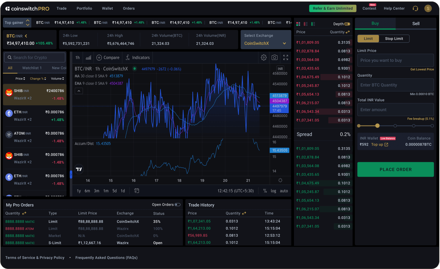
The Current UI
Some Insights
1
Scattered Information
Information lacking logical grouping which lead to confusion
2
Visual Noise
The absence of a visual language led to a cluttered, inconsistent, and noisy UI.
3
Non Scalable Components
Modules were not designed for future capabilities in mind
4
Usability
Accessibility and usability principles were not adequately addressed
5
Non-responsive layout
Layouts were not optimised for worst case usage scenarios
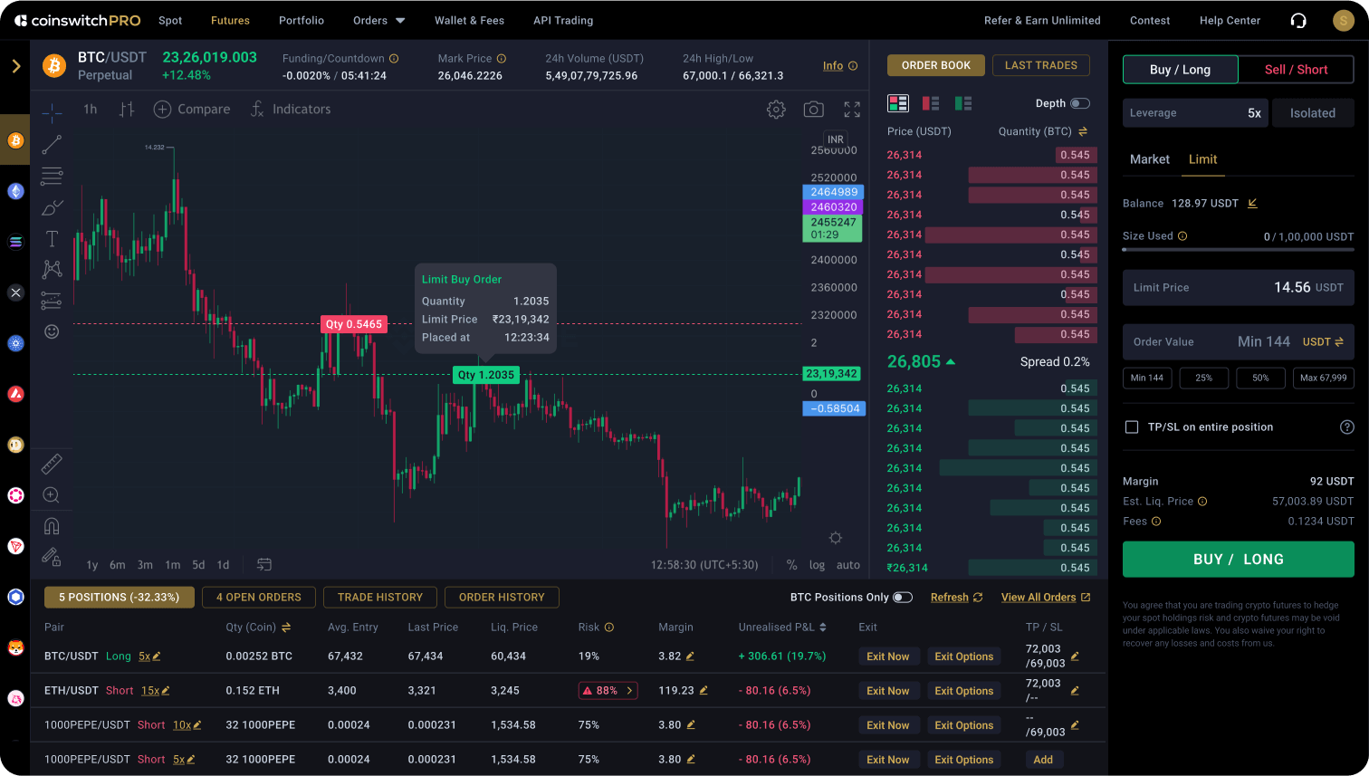
The New UI
Sleek, Functional, Scalable.
EXPERIENCE
Improvements & Scalability
NEW IA
Better logical grouping
& visual heirarchy
A new layout designed for effortless information consumption, with clear grouping and purposeful color-coding.
DISCOVERABILITY
Quick access & comparison of coins.
Completely redesigned module for fast coin discovery, comparison, and category-based exploration.
SCALABILITY
Future proof components
Trade log, coin discovery, order pad and every other module, designed for future expansions
COMMUNICATION
Contextual information whenever needed
Every piece of information disclosed progressively, avoiding overload and enhancing focus
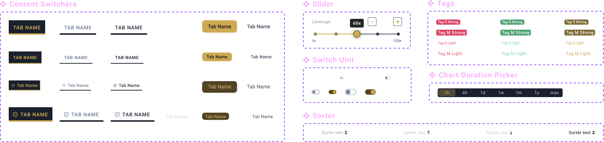
DESIGN SYSTEM
Break & build
Stepping down from the existing UI library and building a new robust system focused on consistency, accessibility, and visual coherence.

Foundations
Retained legacy surface colors

Wider, but lightweight primary spectrum
— reducing shades from 9 to 5 up and down

Pro Gold

Pro Green

Pro Red
Greys Glass greys for accessibility
ensuring text and dividers remain legible over any background colours.


Compact & contextual text style library

Restricted spacing and corner values


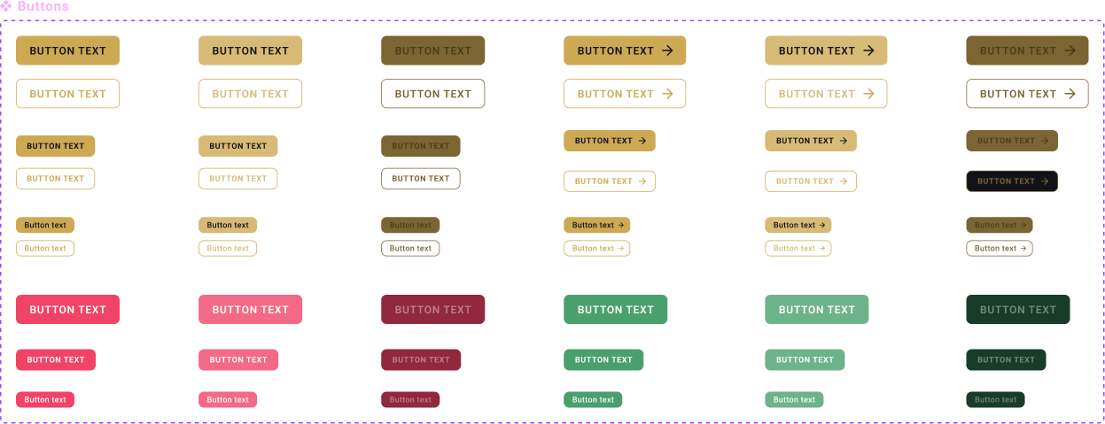
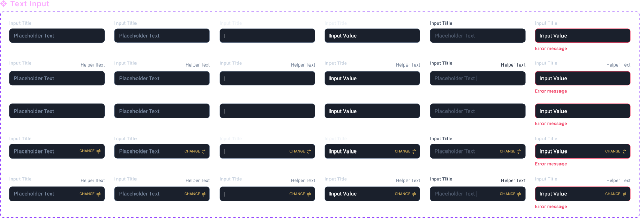
Components
Buttons
Text Input
Utilities

Modules
Price Ticker
Coin List
Order Book
Trade log panel


