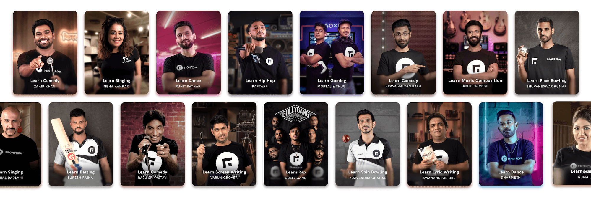
FrontRow Course Cards
Image Compositing
•
Guidelines
2020
Compositing banner images for FrontRow Master Courses
Celebrity-led-courses or master courses are the most valuable selling point at FrontRow. These courses are showcased everywhere including the App, Web interface, marketing materials and so on. Hence it is essential that the banner images for these courses need to be inviting, contextual to the course, and aligned under a common visual language.
Raw image

Composition
Output

Layering of background and subject
The source material for creating the banners are just raw images of the celebrities shot infront of a plain background. As said earlier that the banners need to be in context of the course content, the background is created manually and needs to be aligned with the subject in terms of lighting, camera and compositional values.
Visual guidelines
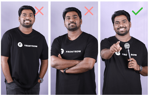
1 • Choosing the right posture
Posture and expression of the celebrity has to be wisely chosen considering the nature of the course to make it feel inviting to the best. A comedy related course can have a funny posture, where as a dance course need to display the attitude.
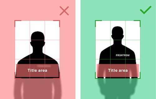
2 • Brand visibility
The clothing of the celebrity has the FrontRow branding on it. While compositing the image, it has to be taken care of. If the logo falls below the lower-third, it won't be visible since that's where the course title element is placed.
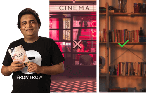
3 • Contextual background
The background should be created using the right elements needed so that it conveys the category/content of the course as much as it can. A wrong background might create a wrong impression, for users who have no knowledge about the celebrity.
4 • Colour tone
A good way to keep consistency across the banners is to grade the colours accordingly. A right mix of cool and warm tones should be the overall look and feel. Skin tones have to be standardised across all images first and then the background elements can be toned.
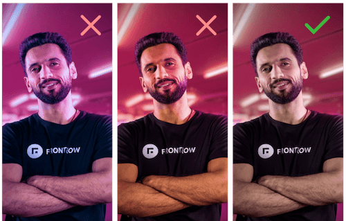
5 • Off-focused background
Even though the background is important to set context about the course, subject should be on primary focus(literally). Hence the background plate needs to be blurred (using lens blur) by creating a depth map as per the scene.
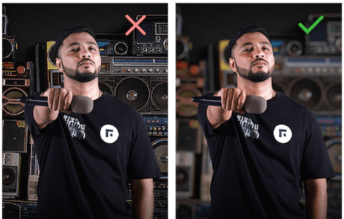
Usage
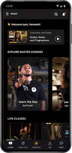
App UI
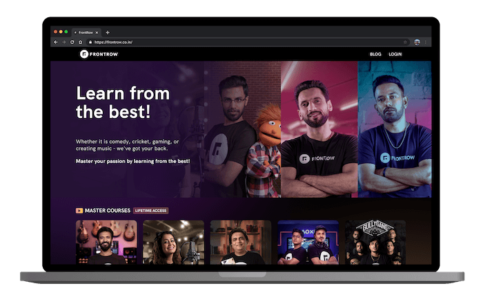
Web UI
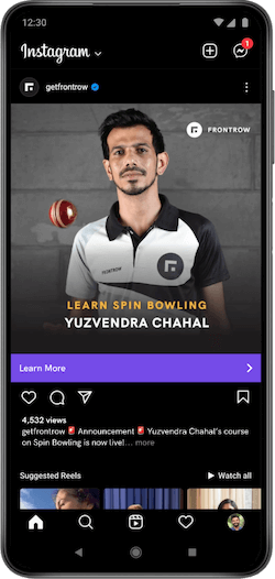
Marketing

