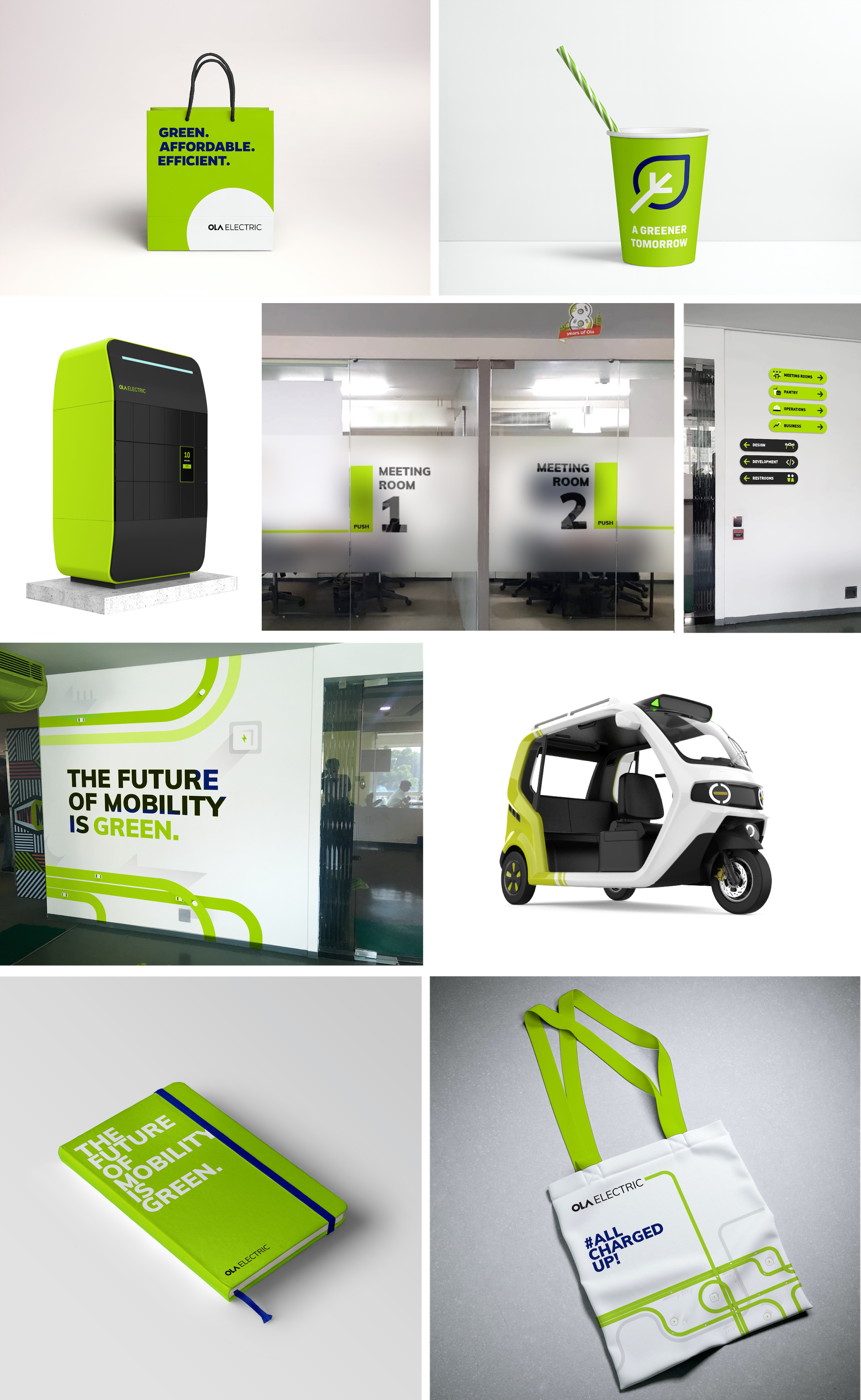
OLA ELECTRIC
Branding
•
Visual language
2019
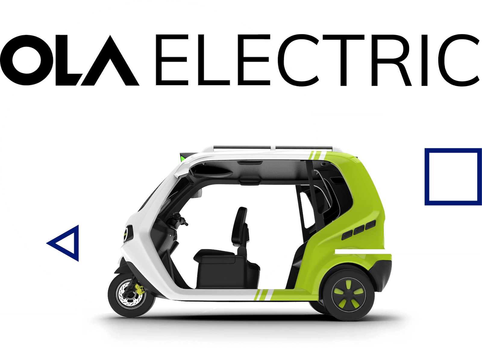
Identity


The logo is a simple wordmark which shares similar language with other OLA sub brands. Except that the ELECTRIC wordmark uses a different typeface and the identity does not have a graphic symbol.
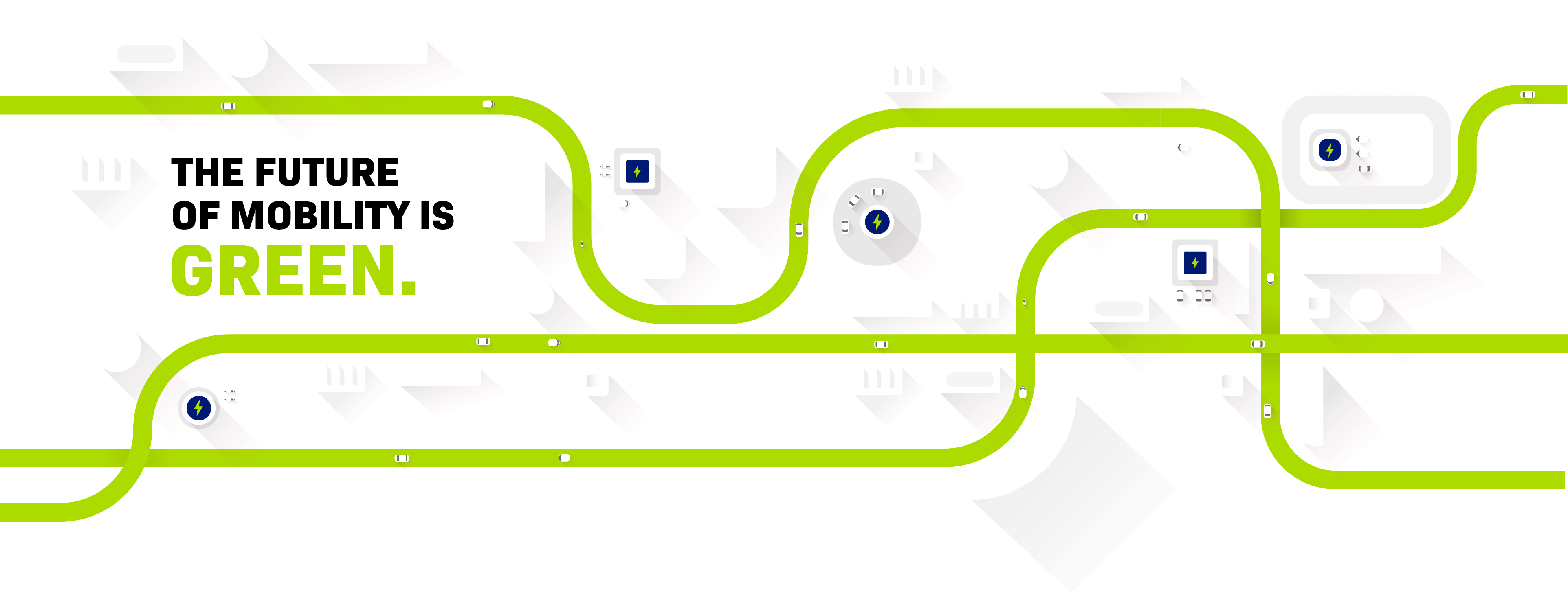
Brand Palette


PROPORTIONS OF USAGE
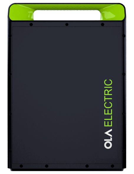
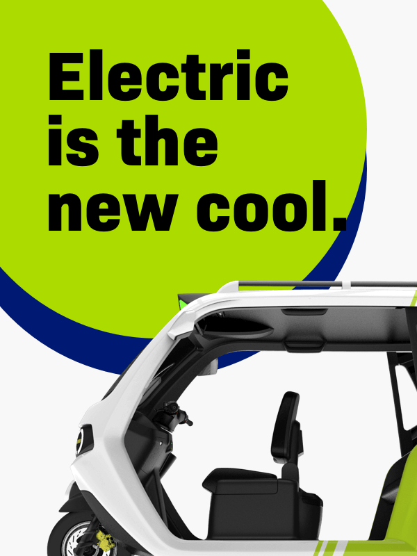
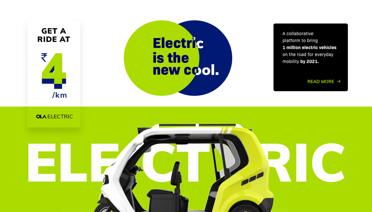
Digital products are preferred to be in a light theme with almost equal weight for white and chartreuse. Whereas physical products comes in a dark theme with extensive use of pitch black supported with chartreuse. In both contexts the electric blue is used as accent colour to express the brand language.
DIGITAL AND PRINT
PHYSICAL PRODUCTS
Typeface

Technical
Narrow
Legible
 Balanced between block and round geometry


Iconography